This month’s Bay Island Bonsai meeting focused on Japanese maple. After studying how and when to pluck, prune and pinch maples, we worked on a maple display.
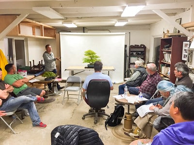

Bay Island Bonsai meeting at Boon’s workshop
The tree to be displayed is in the large category – it’s over 16-18 inches tall – so the idea was to create a two-point display consisting of tree and an accent.
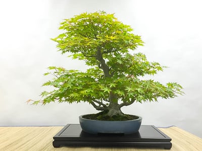
Japanese maple
The stand is simple and low. The low height of the stand limits options for accents as taller accents can begin to compete with the tree. Here is what a number of accents looked like with the maple.
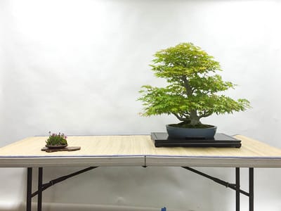
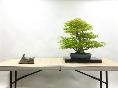
Japanese maple with scilla on wood slab
We found the scilla to be a good size and color for the display. As for the stand beneath the accent, we selected a naturally shaped wood slab as it is lighter in color than the stand used for the tree.
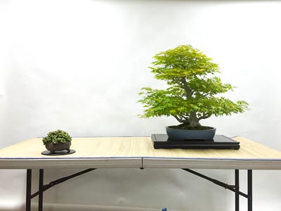
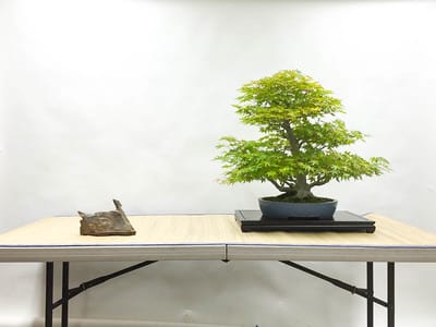
Maple with succulent accent
We tried a succulent next, but found the larger pot size was a bit much for the display, and the color was similar to the color of the maple foliage. The disc beneath the accent was round – a good contrast to the rectangular stand under the maple – though a bit similar in color.
Maple with suiseki accent
Japanese maples are mountain trees so it can be OK to display them with viewing stones, but no one was happy with the stone above. Several of us thought it looked like a swan heading away from the tree.
Turning the accent the other way didn’t help
Figures are another option for maples, but no one was too happy about a cute Soviet-era figure.
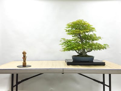
Japanese maple with figure
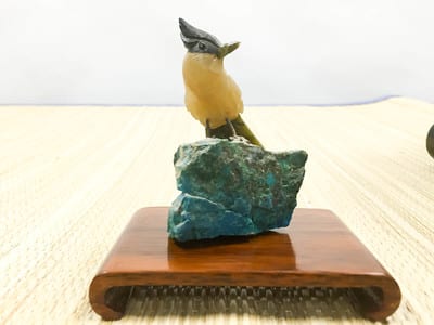
Swapping the wooden man for a bronze bird was an improvement, but the bird was a bit tall considering the height of the stand used for the maple. This figure could have been a better option were the maple displayed on a taller stand.
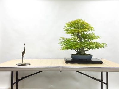
Maple with bronze crane accent
Of the above options, were were happiest with the scilla. With the remaining few minutes, we set up a display with a smaller maple accenting a black pine.
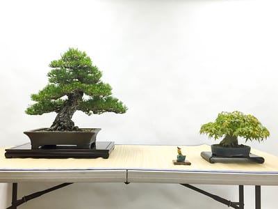
Black pine with Japanese maple
The accent? A small bird on a stone.
Bird figure on stone
Subscribe to Bonsai Tonight
New Posts Delivered Every Tuesday and Friday
Chris Cochrane says
Re’ the two preferred arrangements:
The stand under the J. maple bonsai paired with the multiple blooming scilla is too short. Perhaps, it was the only stand available.
In the 3-point display (red pine, smaller maple & figurine), the smaller maple’s visual flow points out of the display rather than toward the more primary pine & the less primary figurine, The 3-point display would preferably not have repeated rectangular stands. Perhaps they were the only stands available.
Jonas Dupuich says
Thanks Chris – good comments. The photos are a good example of working with what’s available. Regarding the 3-point display, all three stands are rectangular, and the smaller two are even the same style – greater variety of stands would be an improvement.