When I see trees with prominent deadwood, I take note of where the foliage sits in relation to it.
Over the years I’ve found that I prefer designs that make it impossible to separate the foliage from the deadwood with a straight line.
What might this look like? Here’s an example from the 2016 Kokufu exhibit.
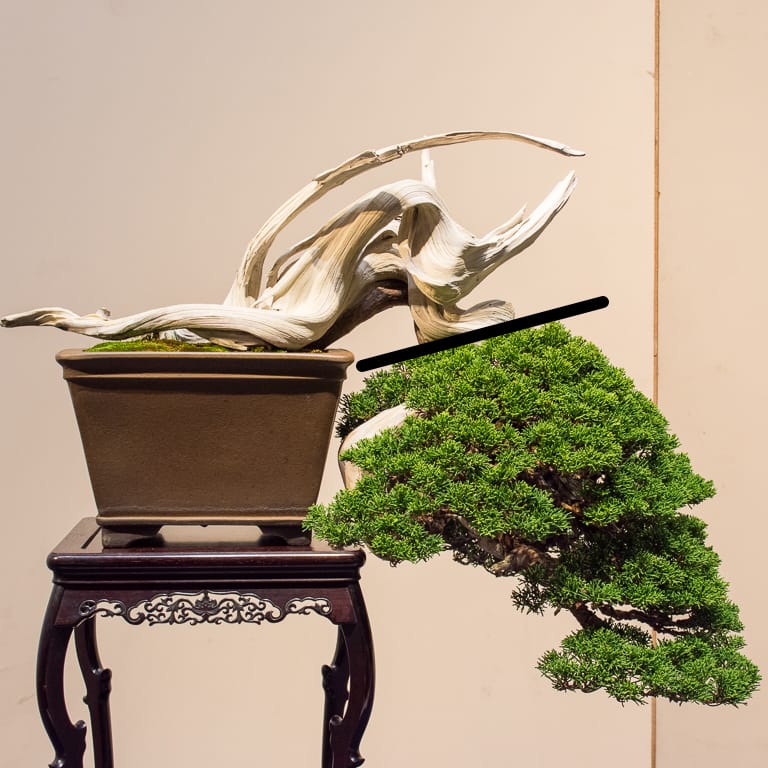
Shimpaku with prominent deadwood
Although the foliage is well-arranged, the key features are the jin and shari near the base of the trunk.
We can see the same phenomenon on pines too.
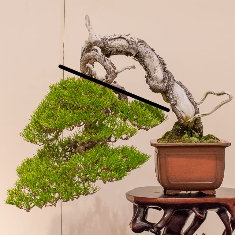
Japanese black pine with deadwood along the trunk
When I see trees styled in this fashion, I immediately look for ways to bend or grow new branches to interrupt the pattern. On the juniper below, for example, I think about what it might look like if a branch poked out from behind the right side of the trunk.
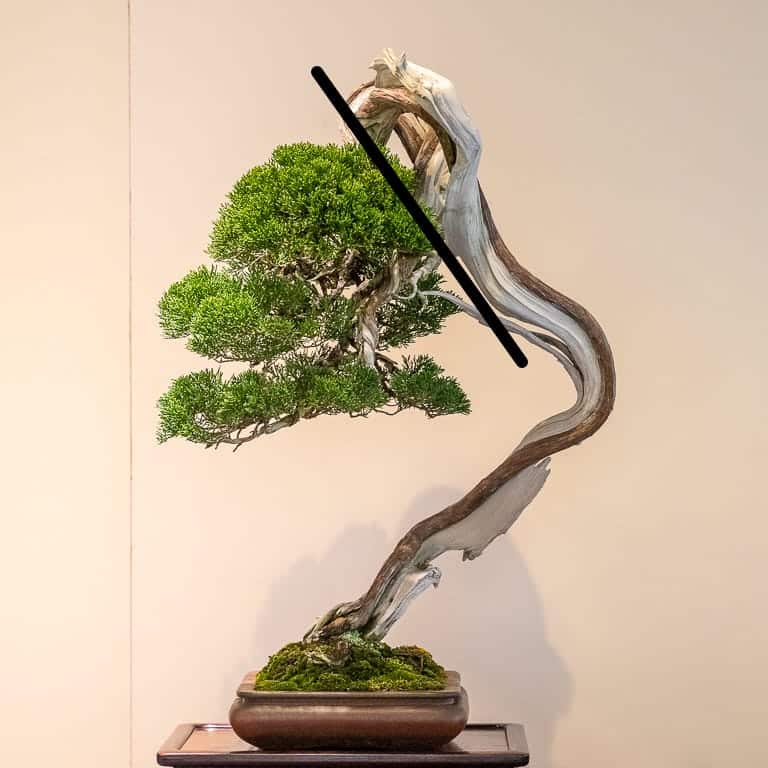
Shimpaku
Sometimes the split between foliage and deadwood occurs naturally.
On the needle juniper below, the lower branches have (presumably) died off leaving only branches that emerge close to the apex. Even bending these branches significantly results in a design where all of the foliage appears on the top half of the tree and the best deadwood features are on the lower half.
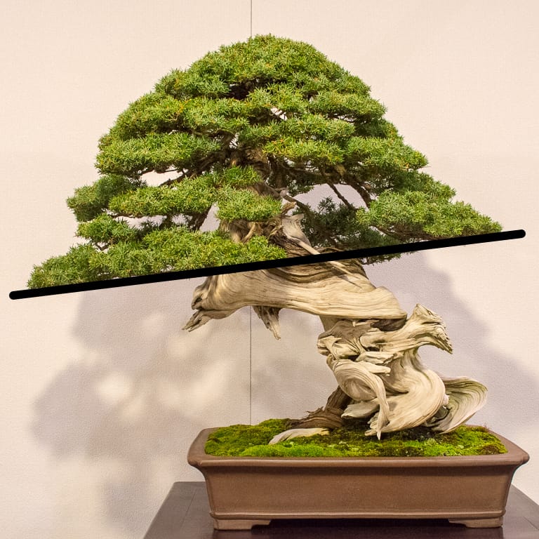
Needle juniper with great deadwood
Instead of lowering the branches further, one option to connect the foliage with the deadwood would be to open more of a window to the upper part of the trunk through pruning or wiring.
Here are two different examples of this approach.
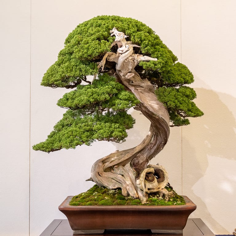
Shimpaku with deadwood in the foreground
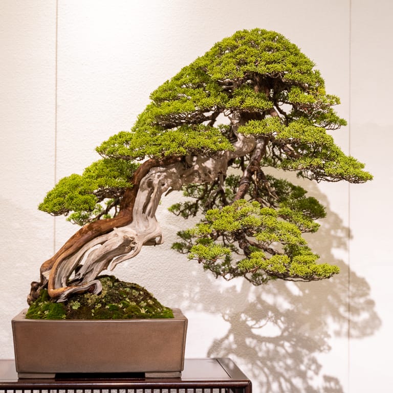
Shimpaku with deadwood visible between the branches
In some designs, the foliage is all on one side of the tree – usually the upper half – but the line separating the two halves follows an interesting contour.
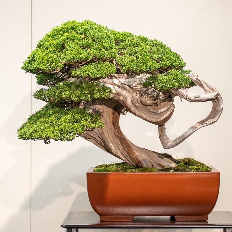
Shimpaku juniper with dense foliage above curving deadwood
Other trees feature deadwood above and below the foliage but convey a separation between the living portion of the tree and the scaffold that supports it.
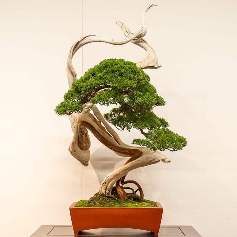
Shimpaku juniper
What I enjoy about seeing whether or not a tree passes “the test” is that it’s not a yes-no question as much as it’s a way to get me thinking about how a given tree works and how it makes me feel.
Do you have similar ways of evaluating – or designing – bonsai? If so, feel free to let us know in the comments below.
Pre-Bonsai Sale This Weekend
An assortment of pines, azaleas, and sekka hinoki, among other species, will be available this Friday, Saturday, and Sunday (11/13-15) at Encinal Nursery in Alameda, California.
Most trees will be in the 15 to 150 dollar range with a few specimen trees mixed in. Feel free to call or write ahead of time with any questions (see contact info at bottom of page).
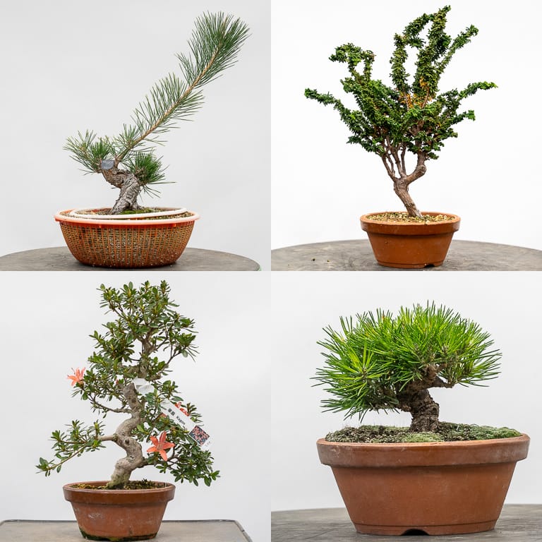
Clockwise from top-left: black pine, sekka hinoki, black pine,
satsuki azalea “Kegon”
Subscribe to Bonsai Tonight
New Posts Delivered Every Tuesday and Friday
Mark says
More firewood. Just what we need.
M.
Peter Grisdale says
Lol, like it or loath it deadwood in bonsai is here to stay it helps to convey age, a tree’s struggle in nature to cling onto a harsh life, if done well it can look amazing, if done poorly it can make the tree look very artificial like a tanuki.
Deadwood is seen on many trees in nature especially high up in the mountains, nature will always produce the best deadwood, we can only try to emulate it the same way we try to emulate other natural feature’s on full size trees.
Beauty will always be in the eye of the beholder and we all have different tastes.
Zack Clayton says
Mark, I used to feel that way about exposed roots. I’ve grown out of it. I still feel some are contrived, but having seen the natural “prototype” I understand it better. Dead wood is the same. I’ve seen some horrendous carving jobs where the tool marks were obvious, others are subtle and natural looking. Go look at nature and consider it.
Chris Cochrane says
Nicely illustrated, Jonas.
With the exception of broom-style bonsai, I have a preference for bonsai above shohin size to have a clear direction in their visual flow. Failure in this regard becomes obvious when ambiguous bonsai are displayed with accessory objects.
For floor (as opposed to multi-tier) displays, I have a preference for tertiary accessories to have a visual flow that reaches toward the immediately preceding object rather than to the primary object of display.
Ryan Huston says
Although I certainly agree with you Jonas and prefer to see foliage mixed in with deadwood rather than have them seem like separated entities, personally I’m also partial to trees which mix new deadwood/jins in with the much older deadwood like sharis and uros. In my mind, this mixing of deadwood features shows that the natural struggle which created the old deadwood features continues to play a role in the tree’s life.
But that’s coming from a “naturalist” perspective.
Jonas Dupuich says
Hi Ryan – good point. I’ve seen the mix of new and old wood on plenty of junipers and even on old bristlecone pines. As for when this does or doesn’t look good on bonsai, it would depend on the execution – as with the dead/live separations. It’s a tricky thing to get right!
Allan Harding says
Thanks for this Jonas. I think we need to think about ‘space’ more broadly and your post encourages that. I have found the approach used in Chinese Penjing useful. In Penjing ‘space’ usually exists in three forms. Open Space or the white space around the tree’s principal components, Enclosed Space that are ‘windows’ surrounded by foliage which lets us see into the tree and, Scattered Space that is typically between branches creating the apex of the tree. Good examples of penjing exhibit all three forms of ‘space’.
Jonas Dupuich says
Thanks, Allan, I hadn’t heard it expressed this way – am curious to learn more about it! If I’m understanding it correctly, I’d expect that some bonsai exhibit all three as well.
Bruce Williams says
Thank you Jonas. this was very informative. I also found the comments above to be helpful in being able to “see” the ideas.