I’m working, this week, on my submission for the Artisans Cup coming to Portland, Oregon, in September. Haven’t submitted a tree yet? No problem, there are still 3 days left. The requirements are simple – a few photos of your tree, a photo of the intended display, and a few words describing your intention behind the composition. Here’s the link to submit now.
One of the cool things about the exhibit is that there are few guidelines for how to display bonsai. Don’t have any stands? Not a problem – any medium will do. While there is a long history of bonsai display in Japan that we see emulated in many U.S. exhibits, I’m more excited about the potential departures from convention that might make their way into the Cup.
For those going the tree/pot/stand/accent route, now’s the time to dig through all of the stands on hand to see which elements work best together. Of course, this is easier said than done as anyone who has setup an exhibit knows how difficult it is to find just the right elements for display. The following attempts at a display for a Korean hornbeam make this clear.

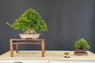
Display 1
The elements here are a medium-sized Korean hornbeam, a small black pine, two stands, a slab and an accent. I like the color and style of the stand for the hornbeam, but it’s a bit lightweight for the tree. Maybe something heavier will do.
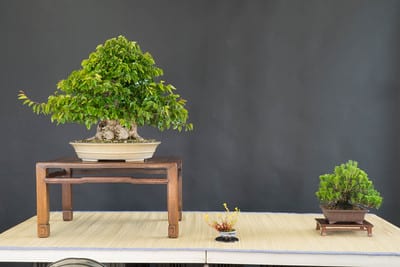
Display 2
I like the size and weight of this stand – made by a local craftsman – but I prefer the darker color of the previous stand. The accent here is next to the smaller tree. What if we move it so it complements the main tree?
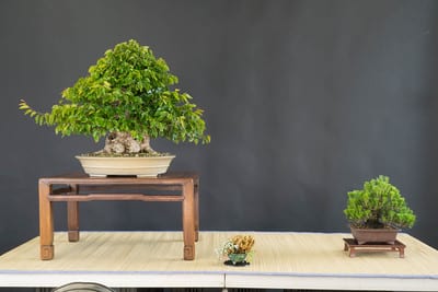
Display 3
The accent looks good with the main tree, but the accent is on the small side.
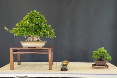
Display 4
Here is a slightly larger accent, though it’s still on the small side. Would raising it make a difference?
Display 5
The additional height of the accent here is nice, but the stand is a bit much for my taste. More importantly, the pine, being much smaller than the hornbeam, benefits more from the accent than the hornbeam does. I also think the stand is small for the pine.
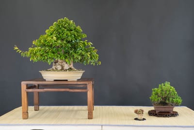
Display 6
Here the accent is again next to the pine, and the pine has a slightly different stand. The color and detail is nice, but how would a slightly larger stand look?
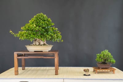
Display 7
The size of the stand is good, but now the color is off, and it’s a too similar to the color of the stand for the hornbeam.
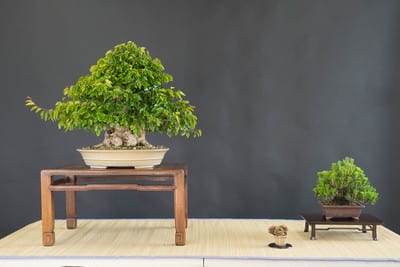
Display 8
Here’s a slightly larger and darker stand for the pine. I like the color, but the size is a bit big for the tree.
What to do? I can leave it to someone else to decide. I can eschew stands in favor of a concrete block, though that’s been done before. Or I can keep experimenting – there are, after all, a few days left before submissions are due.
Still have questions about the Artisans Cup? Check out the event’s FAQ.
Subscribe to Bonsai Tonight
New Posts Delivered Every Tuesday and Friday
Chris Cochrane says
My understanding is that In chuhin/shohin/accent exhibition as well as in full-sized alcove display, the tertiary obect on a single display floor with rare exception accents the secondary object. Its placement closer to the principal object does not alter that the tertiary object (the accent plant) face the secondary object (the pine) and relate to it rather than to the principal object (the hornbeam). The accent could be on the far side (to the left) of the hornbeam from the pine & would still relate to the pine & not the hornbeam.
Jonas Dupuich says
Thanks Chris, I hadn’t thought of it that way. Another approach: pine on the left, hornbeam in the middle and the accent on the right.
Dave says
I love that Hornbeam. It just gets better every time I see it.
Richard says
To my eye, Display # 6 offers the right balance and harmony. The pine feels too prominent in all the others, perhaps because it sits on a stand with legs. A great reminder that beauty is in the eye of the beholder.
Chris Cochrane says
The respect for empty space between each element is a highlight for each of these displays; spacing varies between each element horizontally and varies if following elements from principal object (hornbeam) to secondary object (pine) to tertiary object (accent plant) in somewhat diagonal (left-to-right & front-to-back simultaneously) directions.
Richard’s choice (Display #6) is mine as well for balancing the plant, pot, & stand/board elements in size, shape texture and color. The stand for the pine in Display #6 is a arguably too short in height, but it adds to the feeling of naturalness & informality. Heightened feeling rather than perfection in technique is always favored! A smaller accent is often a good choice for chuhin bonsai arrangement if it equally conveys seasonality; this accent plant complements the smaller pine bonsai rather than the hornbeam.
I prefer the combination of the hornbeam (near center & deep on the display floor), visually flowing toward the pine which ideally would be close-enough to fall under the imagined extension of the hornbeams silhouetted canopy. The accent could then be placed at a somewhat longer distance from the hornbeam on its opposite side. Distant space between the pine & the accent plant arguably leaves room for the imagination to fill the scene as the viewer appreciates each element in easily discerned order:
1. the hornbeam… then, its pot… and then, its stand;
2. the pine (metaphorically canopied by hornbeam), its pot, its stand;
3. the somewhat distant accent plant, its pot, its stand; and
4. a gestalt of the entire display, especially noting empty space which encourages the mind to fill with feeling.