On Tuesday, I posted an update showing fall work on a cork-bark black pine (see “Cutback” for details). Today I’d like to critique the tree and talk about design goals for future development.
For reference, here’s the tree after thinning the foliage and wiring key branches.
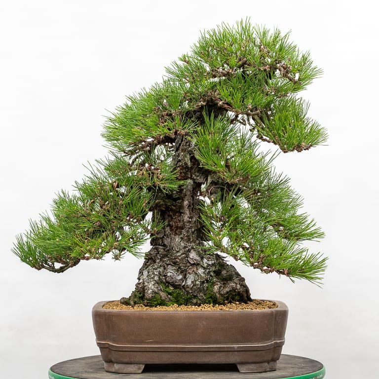
Cork-bark black pine in a Gyozan pot – 24″
Although I’ve been working on the tree for a long time, the work has been limited as I can’t bend old branches as much as I’d like without risk of breaking them. This is a common challenge when working with cork-bark varieties (see “Increasing branch density” for photos of the tree from 2004).
I am, however, free to bend the slender ends of branches, and it’s the arrangement of the slender branches that gives a tree much of it’s character.
Before discussing the the tree itself, do you know the “squint test”? When you partially close your eyes, you can see images without all of the details or colors that can distract us from seeing basic shapes. I’ve been squinting at paintings in museums for years and I do this with bonsai too. To help you visualize what I’m talking about, here’s the same image in black and white.
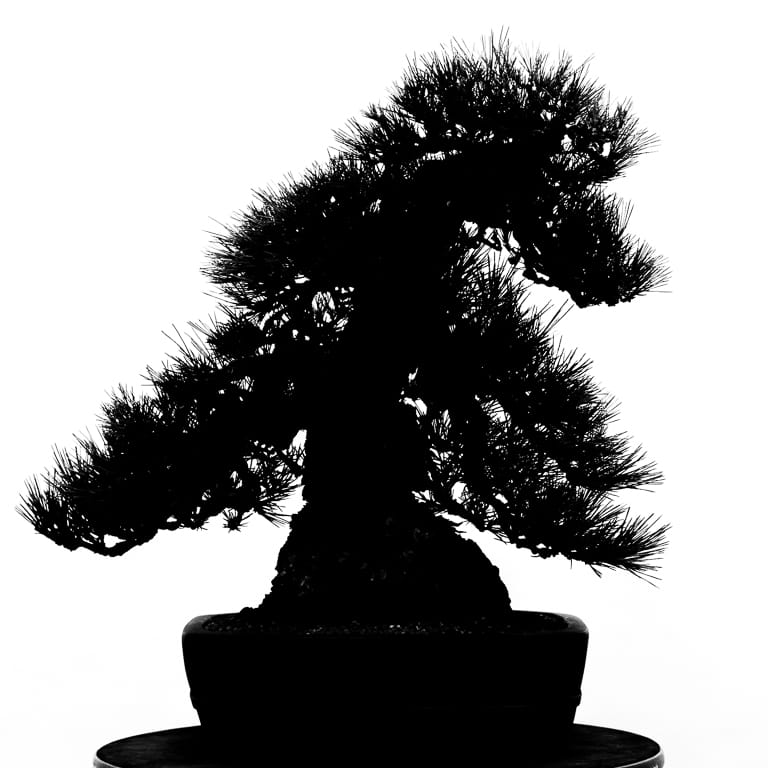
The pine in black and white
What’s funny is that even when I look at the black and white image, I still squint my eyes to get a sense of the blocks of foliage. This is what I notice.
- The lowest branches on both sides of the tree are similar in size, shape, and level (they’re roughly equidistant from the lip of the pot).
- The top of the tree seems separate from the lower portion due to the lack of branches on the upper right side.
- The crown blends in with the lower branches smoothly on the left side but there’s an awkward transition on the right side.
What can I do about this?
- The first branch on the left is slightly higher than the first branch on the right. I’d like for the first branch on the right to be higher. Because bending corked branches risks breaking them, I can achieve the same effect by shortening the first branch on the right.
- As for the gap on the upper right side, I can grow out branches on the back of the tree to fill in the silhouette.
- To create a smooth transition between the crown and the branch below it on the right side, I can shorten the branches on the crown after young buds develop that I can cut back to.
I’ve also thought about making more dramatic changes to the tree like changing the front or removing the top third of the tree. The reason I’ve maintained the current front is that it does a good job of conveying the tree’s character in the corked bark of the trunk. Plus, the branches are awkward from almost every other angle. Here’s the tree from the left, right, and back sides.
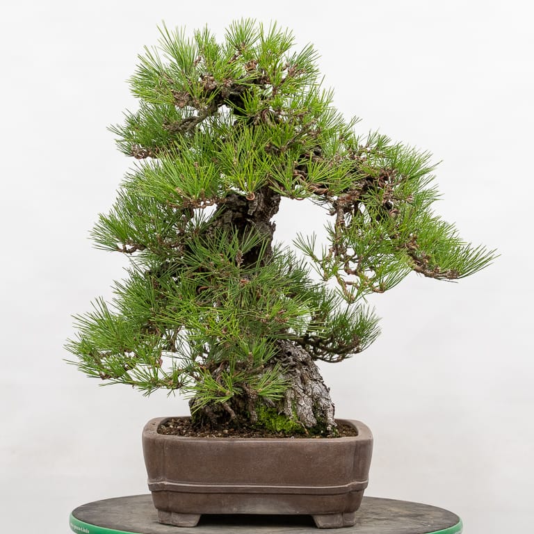
Right side
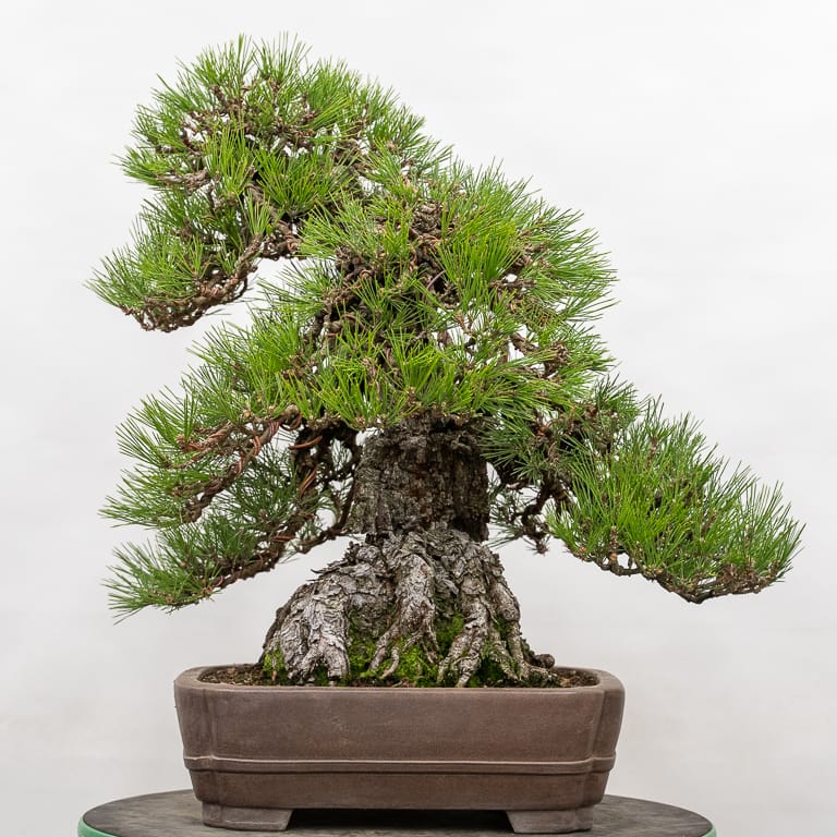
Back side
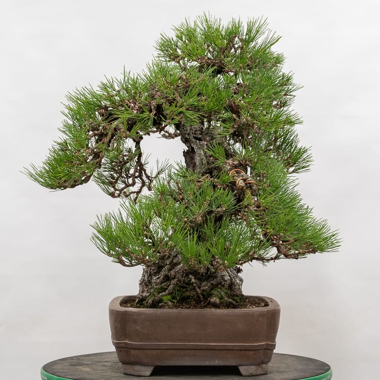
Left side
The view from the left side does a particularly good job revealing the awkward back branch that makes selecting other fronts challenging.
My favorite alternative is the view from the right side with the tree at a slight angle.
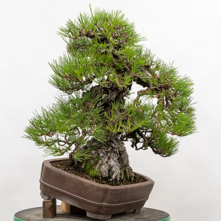
Alternative front
As nice as this side is, the base of the trunk is narrowest at this point and the tree has a single back branch from this angle that protrudes far from the trunk.
My favorite thing about the current front is that it makes the tree look old. It’s easy to appreciate the corked bark from this side, and the stooped apex and drooping branches do a great job of conveying the tree’s age.
Do you have suggestions for making improvements? If so, I’d love to hear them. Feel free to share your ideas in the comments below.
Subscribe to Bonsai Tonight
New Posts Delivered Every Tuesday and Friday
Tpm Regelski says
I don’t favor the “hole” in the rmid right side. My eye is drawn to itrather than to the shape of the tree. Of is that because the background is starkly white? Or should that matter?
Jonas Dupuich says
I’m with you Tom – as it is, the gap is distracting to me too. Although it’s easier to see in black and white, it’s noticeable in color too.
Zack Clayton says
One of the things our club recommends is when you have a branch that is too rigid to make a big bend, make it a several year project of small cumulative bends. would this work on cork bark or is there a “memory shape” that you can’t get past even with the slower series?
Jonas Dupuich says
Good suggestion Zack! For corking varieties, it’s more a matter of the twin challenges that the live portion of the branches are slender and brittle and the cork itself can easily pop off if manipulated. Were it not for this, the slow approach would be a great way to make the bends.
Doug Zeeff says
Would it be possible to make the gap on the right an integral part of the design? My thinking is to make a similar gap on the left at the next lower branch. Then finish with a gap on the right just above the bottom right branch. Just a thought.
Jonas Dupuich says
Hi Doug – I like that idea. As long as there’s consistency across the tree the gaps can become part of the character of the silhouette.
Due to the way the branches are currently structured, they would look relatively long and slender which isn’t as good a fit for a heavy trunk. What I might be able to do is find opportunities for openings that maintain the full silhouette – will see what I can find!
Robert Potts says
Obviously a great tree. I like the current front, but what jumps out at me stylistically is that the first few inches of base and trunk seem to have a slight left movement, but the apex is very strong to the right. Is that intentional, and if so, why?
Would eliminating the right part of the apex, bring the visual weight of the top back to the center be an improvement? (If that is even possible without re-growing the whole apex) Or would that make it too uninteresting?
– bob
Jonas Dupuich says
Thanks Bob! You put your finger on the big question about the tree – would reducing the apex be an improvement or would too much character be lost?
Removing the top the trunk would eliminate the taper and reduce the movement to a simple line. Maybe because I’ve seen so many straight-trunked cork-bark pines, I’ve opted to keep the angular apex to preserve the tree’s history and character. I considered tilting the some years ago but didn’t want to bury more of the roots than necessary.
I have no idea if the subtle movement in the lower trunk or the strong movement at the top was intentional or if nature took its course as the tree matured. I suspect the latter but I don’t know.
Re-growing the apex actually doesn’t take too long. The current top developed from three shoots over the past 15 years: https://bonsaitonight.com/2018/06/15/increasing-density-on-a-cork-bark-black-pine/
Joseph says
So I’m going to propose a dramatic option and say that I like the back as the new front with the top third removed, as you suggested. It might not show off the bark, but I think the surface roots on that side are much more interesting. Then reducing the first branch on the new right (old left) can give you the difference in levels you’re looking for and (if I’m associating the branches from the different shots correctly) should clear up some of the awkwardness from other angles. These are dramatic changes though. Good luck!
Jonas Dupuich says
That is a dramatic option – thanks Joseph! I too like the roots from the back, and without the top of the tree, it’d be easy to create an attractive silhouette. The big challenge would be how to handle the single branch on the new front as it grows straight toward the viewer. Will keep this option in mind too!
scott chadd says
the most dramatic change is the one that will advance the design and increase the sense of age, mass, and drama. remove the top 1/3
José Alberto Domingues Pereira says
Hi Jonas.
I’ve used your image in order to make a smaller tree.
it’s seems more compact. Maybe you like it!
https://ibb.co/JmNy5fR
Bob Anderson says
The silhouette shows that the dominant lower branch is on the left whereas the trunk moves somewhat to the right and the apex moves strongly to the right. If the left branch is reduced in length and the foliage on that branch is lightened, then the lower branch on the right becomes the dominant branch and the overall movement is now all to the right.
The effect can be easily seen in the silhouette view by covering the outer 1/3 of the the left lower branch with your thumb. In my opinion, this gives a more settled look and requires relatively minor changes to a very nicely developed tree.
Jonas Dupuich says
Thanks Bob! I like that this approach is simple and quick – thanks for the suggestion!